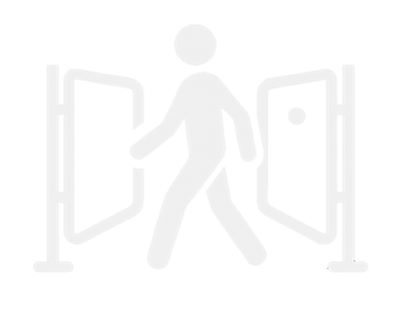
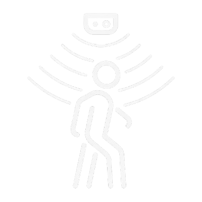
TULE UUDISTA INTELLIGENTSEID TURNIKEESID JA LÄBIPÄÄSU VÄRAVAID!
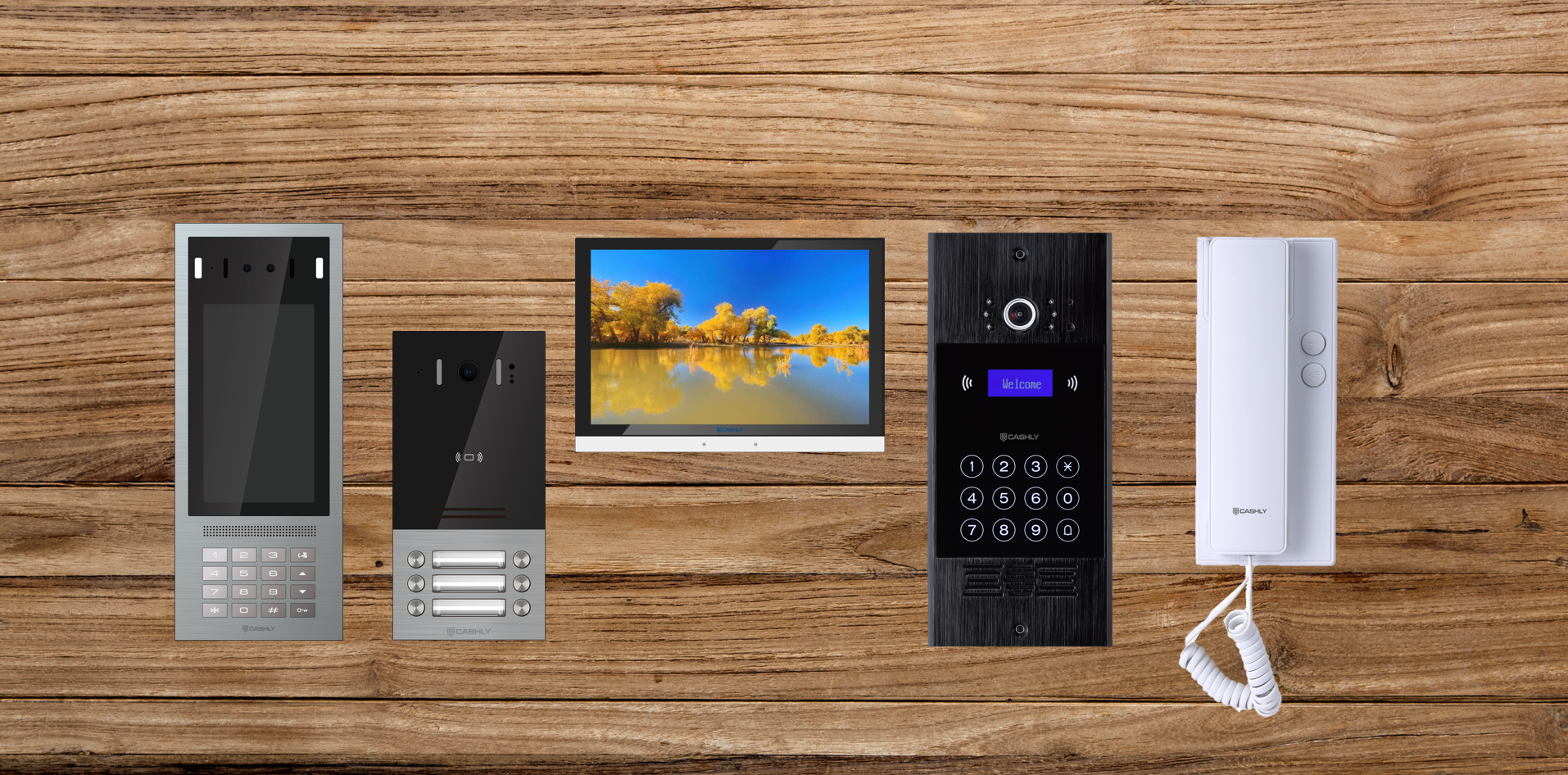
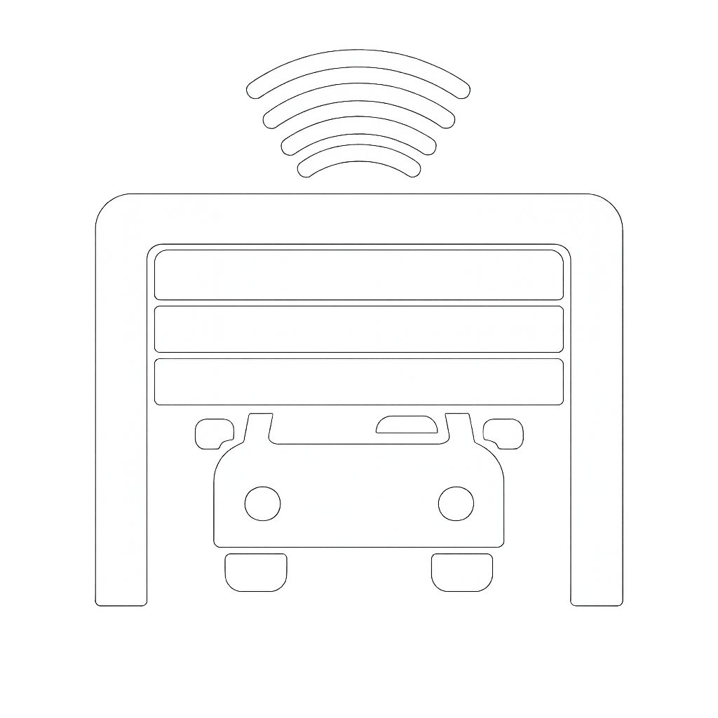
IP, VOIP, ANALOOG FONOSÜSTEEMID/KÕNE-SEADMED